

With Old Boy's title sequence we see a strong theme of time going past. Through out the whole sequence we have this theme of time passing in a way representing all the years that the main character had spent imprisoned.
The Title sequences has a thin line text and from the animation of the text being removed for left to right, to then change from numbers to letters, we get the scene of a train station board or a alarm clock style of changing times. Through the sequence the text is changing colour from blue, purple, orange but mainly sticking with white, red and pale white. With the red this could be representing of the danger to come.


We then go into the final sequence where we are presented with the title of the movie. We zoom out form a clock to see the a letter of the title and the for the title to expand from this single letter quite faded and to sort of role into place some even carrying of the screen. Then we still stick with this clock them where the end of both words, "D" and "Y", keep on rotating like clock handles, keeping this theme of passing time being a whole main point within the movie.
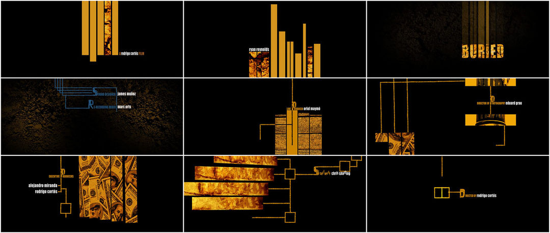
When original watching this title sequence the first thought to the audience will be that the text is rising but this is not the true effect of the writing use. While the text may scheme to be rising from the bottom and then being pulled away at the top, in fact the audience is sinking.


As stated before in the beginning of the sequence we don't really see this form of us, the audience, sinking, as the letter fade in from the bottom and at the top each float up. Even when graphical lines some with images of dirt in we still don't see this image of us falling.


This is until we see the title. When the title appears this is when we notice that we are skinning because of the dirt in the background gives a more stable view and we know that the ground can not float up and from the dark atmosphere we can only tell that we are traveling down through the ground and being buried ourselves.


The writing then changes from is gold colour, that represents the ground, to a blue colour. From this change and from the graphical lines now becoming smaller and overlapping we can tell that these represent water lines the go underground. In a way the title opening is an establishing shot of just how far in the ground the character is located. We then go back to this gold colour writing but this time get image off bullets and money, this gold colour that we first represented with the ground is not representing danger and greed. This creates foreboding into the movie as now we know that someone is under ground and that it could do about money and a dangerous deal.
No comments:
Post a Comment