- The Conjuring (2013)
- Red Lights (2012)
- Any Human Heart (2010)
1) The Conjuring (2013)

Click to watch
 The first shot of the title denotes two old black and white photos of what seems like a family. The text overlayed on top (using post-production editing) says "The Perron Family".
A sans serif font is used to make the reading of the text easier for the viewer and the colour of the text is black to contrast the white background. The text size varies in the shot where the less important word "the" is smaller than the rest of the text to give significance to the other 'more important' text.


In this shot, the black and white theme in the title sequence continues but a different editing effect is used. Here the credits are 'laid' onto the page by using a wipe/post-production effect to make it look as if a page of a book was turning. This is effective as it catches the audiences attention to the new text appearing on the frame.
The text is placed in an empty area so it is easier to see, and once again the text is edited in a contrasting colour to the background (white).


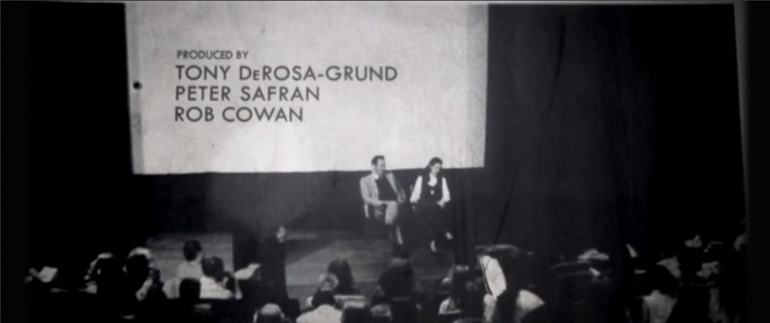
In this shot, a piece of paper slides into frame in a turning motion from the left. The piece of paper then denotes a show with an audience, then the credits are edited onto a white space in the photo. The changing of movement in the title sequence engages the audience and makes the piece visually exciting.
The ongoing reference to photos, books and newspapers suggests that an event in the film may have been on the news and effecting the families in the photos. The photos are also old suggesting that the events took place in the past?


This shot uses a combination of a dissolve and focus pull to change from one credit, to the next. Both the dissolve and focus pull have a fast pace to add tension, and a sense of action.
In the title sequence, a non-diegetic soundtrack is used throughout to add atmosphere to the sequence. The soundtrack is orchestral with added foleys positioned in time with action in the title sequence. The soundtrack also has various crescendos and decrescendos to add suspense the piece.
Overall I think the title sequence is successful in engaging the audience before the film starts, and hints at potential outcomes in the story-line.
2) Red Lights (2012)

Click to watch
The colours in this title sequence are mostly black and white, but some red has been included in some shots to show a contrast. It also obviously anchors to the title that denotes 'Red Lights'.

The first shot in the title starts off with a high pitched, screeching non-diegetic soundtrack followed by an instrumental piece with a fast tempo. The initial screeching sound may be used to shock the audience and engage their attention.
The start of shot also denotes letter 'flying' into the frame from the bottom left corner and assembling to read the name 'Cillian Murphy'. The text is also accompanied by semi-transparent circles which quickly decrease in size and then fade out. These circles look like light which refers to the title of the film.
Once the text has assembled in the center of the frame it gradually increases in size and several letters magnify and flash on the screen. This visual effect again refers to the title of the film, but it also ensures the sequence to be enticing to the audience.
 The circles appearing and the magnification of letters repeats in the next shot, but once the letters have assembled, an image of two hands appears behind the text for a fraction of a second. The image is silhouetted to add enigma, as the audience do not know whose hands are displayed in the image.
Mean while, the non-diegetic soundtrack continues with a fast tempo but also gradually raises the pitch of the soundtrack to build a crescendo. This therefore creates suspense and tension for the audience. The soundtrack is however parallel to the imagery as there are 'booms/thumps' when new text is displayed to add to the atmosphere of the title sequence.

The soundtrack in this shot continues to build crescendo but at the end of the shot, a fast decrescendo is present.
The text throughout the title sequence is a sans serif font and is similar to the text in 'The Conjuring'. This font is easy the read therefore making it suitable to an audience with different abilities of eyesight.
3) Any Human Heart

Click to watch
This title sequence uses silhouetted shapes and animation to illustrate a man taking a walk on what looks like a journey. 


Overall I think that this title sequence easily engages the audience into watching the title sequence and hints at a plot line that consists of a man travelling to the city, or a mystery/detective theme being shown?
No comments:
Post a Comment